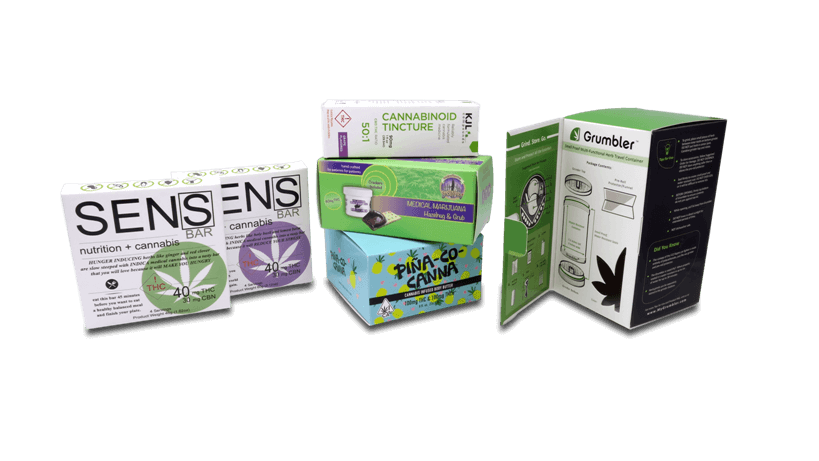

With a new slew of states having legalized cannabis, the cannabis industry is now one of the fastest-growing industries in the United States and possibly even the world. While product packaging for cosmetics, pharmaceutical products, and more have settled down over time to a loose set of expected colors, design styles, and information with some room for variation, the cannabis industry is notable in part for its vast range of packaging styles. Whether you’re an entrepreneur looking for inspiration for your very first product launch or you’re a seasoned veteran of the industry, it’s worth knowing some of the looks that are trending in cannabis packaging right now, both in our showroom and worldwide. Let’s take a look:
Green
The color green is one of the most common colors for cannabis packaging for many obvious reasons. A clear tribute to the classic cannabis leaf symbol, green also emphasizes the natural origins of cannabis and can hint at any healthful benefits of your product (below). Color psychology also makes green a great match for cannabis, as the green is scientifically proven to relax people just like cannabis. Because the connection between the color green and cannabis is so strong, however, green runs the danger of being overused and commonplace, so if you plan on standing out, it may be worth exploring other colors.
The Cannabis Leaf
Many people grow up knowing the image of a cannabis leaf logo, and many companies choose to use this familiar image either as most people know it or with a bold twist. This idea works not just because it immediately communicates the nature of your product, but because it also gives consumers a solid idea of how your company would approach and rethink cannabis.
Minimalism
Unlike other design trends that hinge on eye-catching visuals, minimalism delivers an understated appeal that many consumers find refreshing. Minimalism can exude a sense of elegance by leaning on timeless neutral colors, reduced wording, simple fonts, and other design decisions that don’t rely on what some deem empty visual noise to sell products. This also makes it a great option for high-end cannabis companies as the look lends itself well to a sophisticated, luxurious appearance. Depending on how you’d like to characterize your cannabis brand, minimalist packaging is a style that can serve you very well.
Playfulness
This is our big umbrella word to describe packaging that is determined to be anything but serious, featuring things like pun-filled product names, a touch of teasing attitude or irreverence, and certain design elements such as holographic visuals. If the idea of appearing serious and all high and mighty doesn’t appeal to you, developing your brand voice and visual branding into one emanating quirkiness and fun is often a great idea. Consumers enjoy brands and packaging possessing a distinct personality, and using the progressive, free-thinking cultural associations people have with cannabis to create a refreshingly sassy or tongue-in-cheek brand can be a move that attracts many consumers.
A Focus on Health and Eco-Friendliness
Consumers are increasingly conscious about the products they use and are often especially sensitive to the products they directly consume. If your cannabis product can be considered pure, unprocessed, organic, or something similar, expressing this within your product packaging—with the color green, if you like—can go a long way toward building consumers’ trust. In addition, the eco-friendly packaging trend that many have embraced in recent years is worth looking into depending on your defined target market. As a side note, we print all our boxes using soy ink and offer boxes made from 100% recycled paperboard upon request!
Whether you’re scouting around prior to meeting with a designer or in the middle of designing new artwork, we help these tips and trends help jump-start your creative thinking. If you’re ready to move on to packaging, you’re always welcome to contact us through email or our “Free Quote” form!
References: